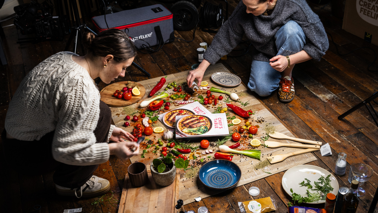
Karen: What considerations go into styling food for a premium, festive-focused publication like Chef’s Table?
For me, it always starts with the food itself, it is important to not over-style it. Because it’s festive, there’s naturally a bit more richness and warmth in everything. You’re leaning into deeper colours, softer light, a sense of abundance, but still keeping it tasteful and not over the top.
We also think about how it all sits together across the magazine, there needs to be a consistency in tone while still letting each recipe have its own moment. It’s a lot of instinct as well. You’re constantly asking yourself, does this feel like something you’d want to sit down and eat? If the answer’s no, you pull it back or start again.
Karen: How do you work with Sharon during a shoot to ensure the food looks its absolute best on camera?
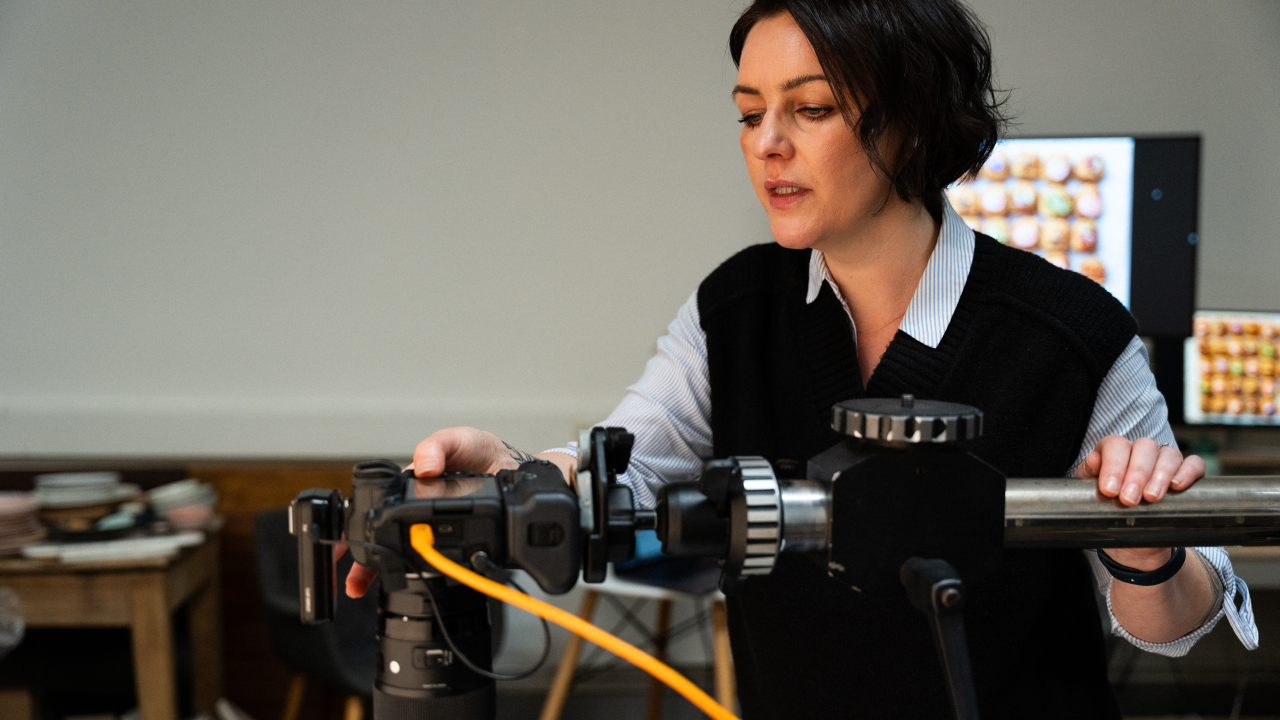
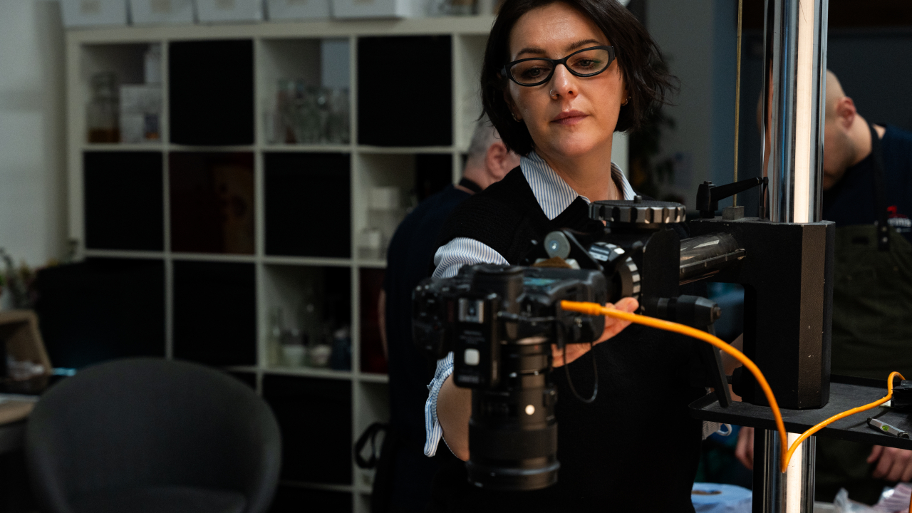
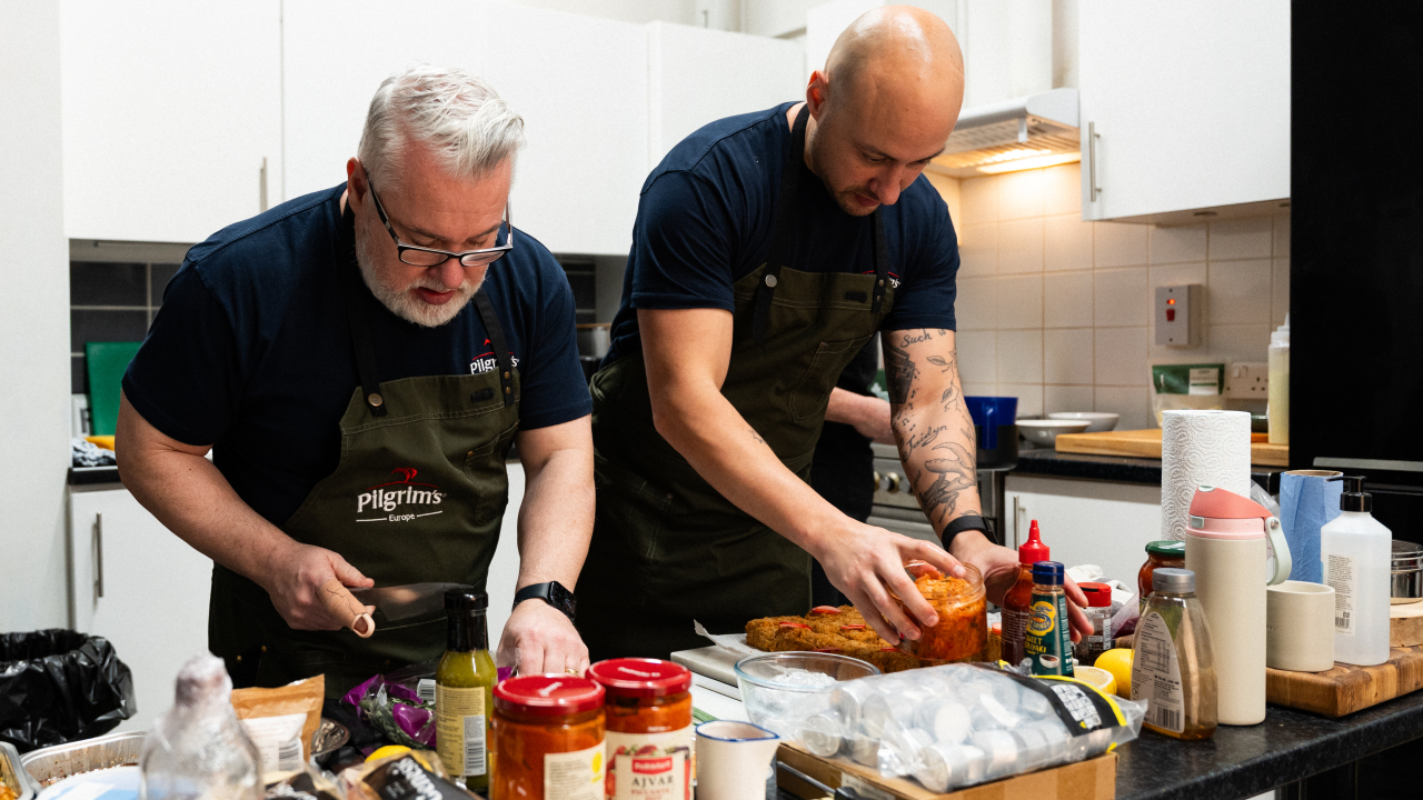
Sharon and I have worked together full-time for the last three years, but we’d been dipping in and out of jobs together for about seven years before that so at this stage, we almost know what each other’s thinking without saying it.
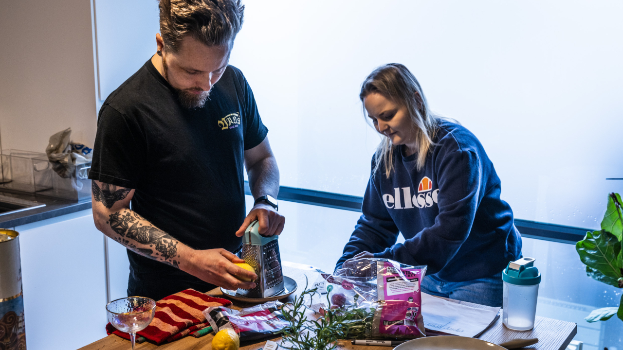
It’s very fluid when we’re shooting. I’ll be building the dish while she’s creating the light, and we’re constantly tweaking things together but those little changes make all the difference. There’s a lot of trust there. I know how she sees things through the lens, and she knows how I’m thinking about the food. So it never feels forced it just kind of comes together naturally
Karen: Were there any particular props, textures, or styling techniques that helped elevate the overall aesthetic?
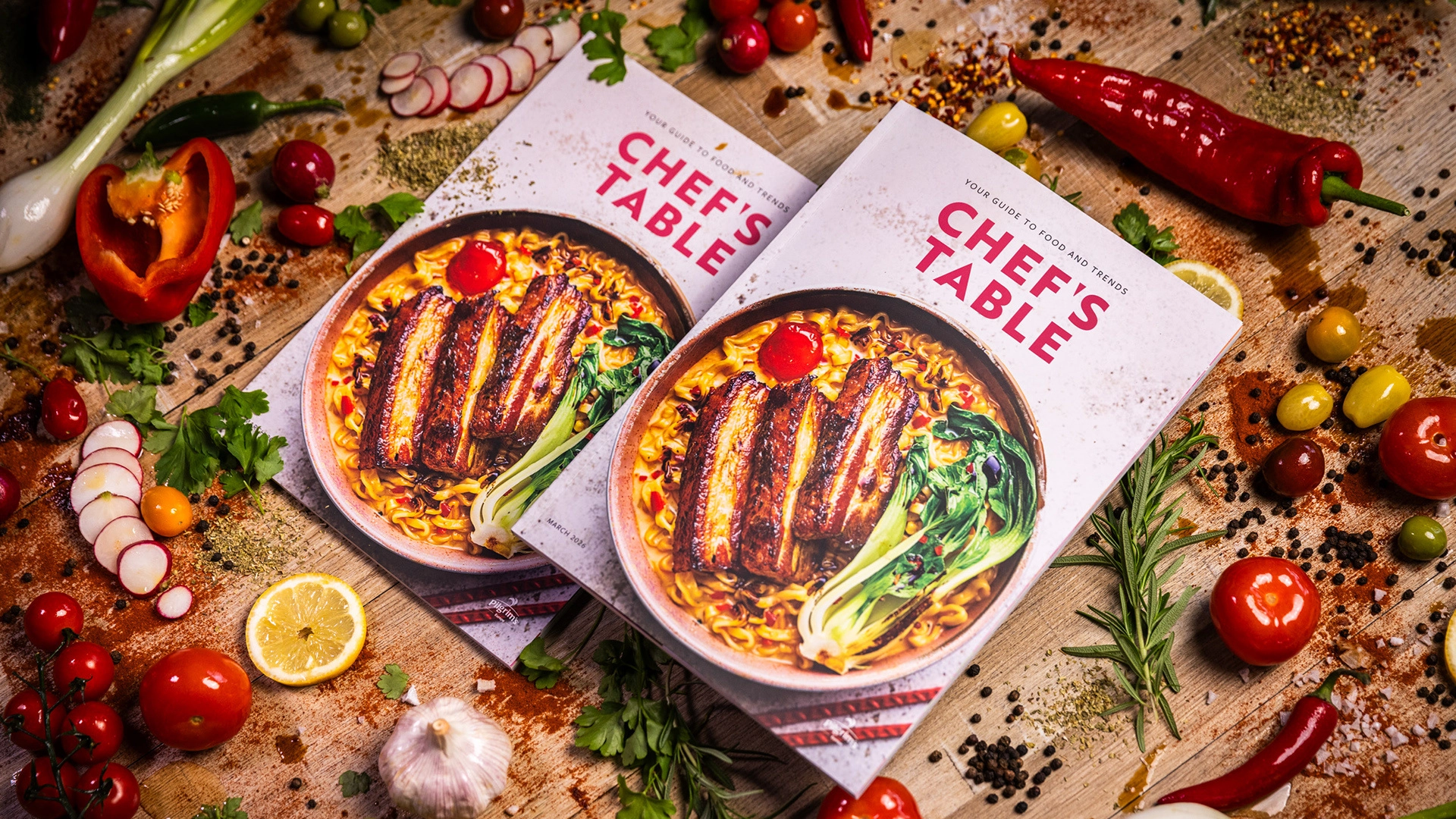
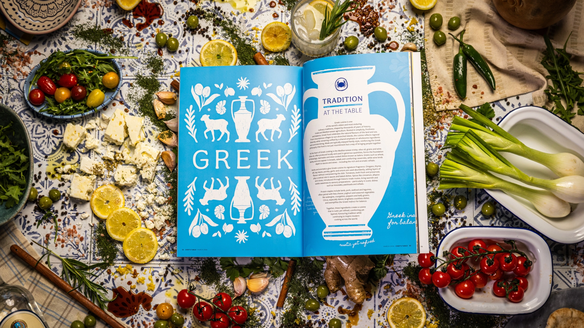
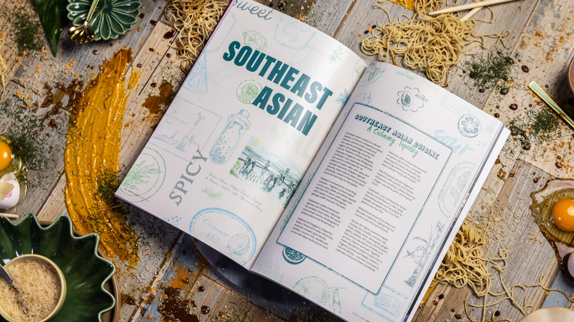
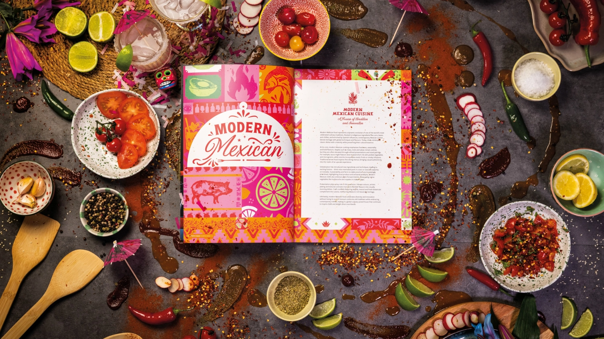
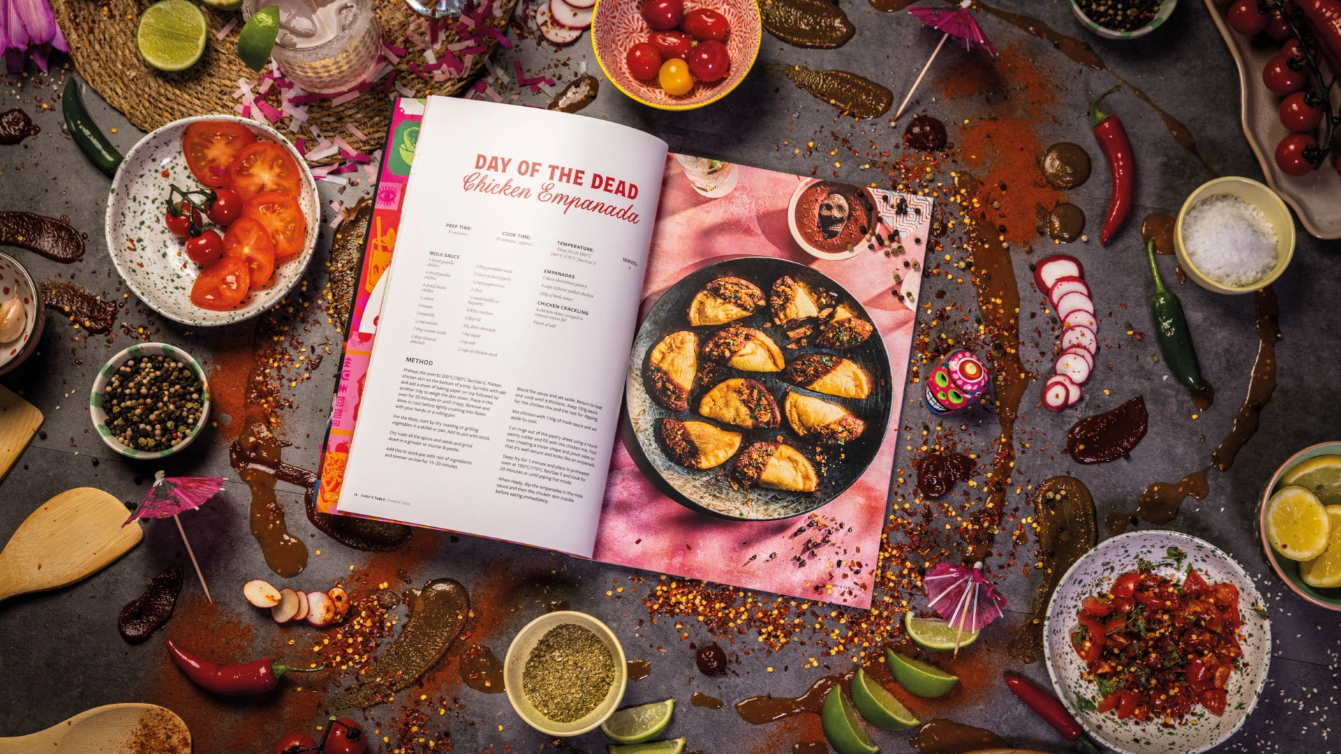
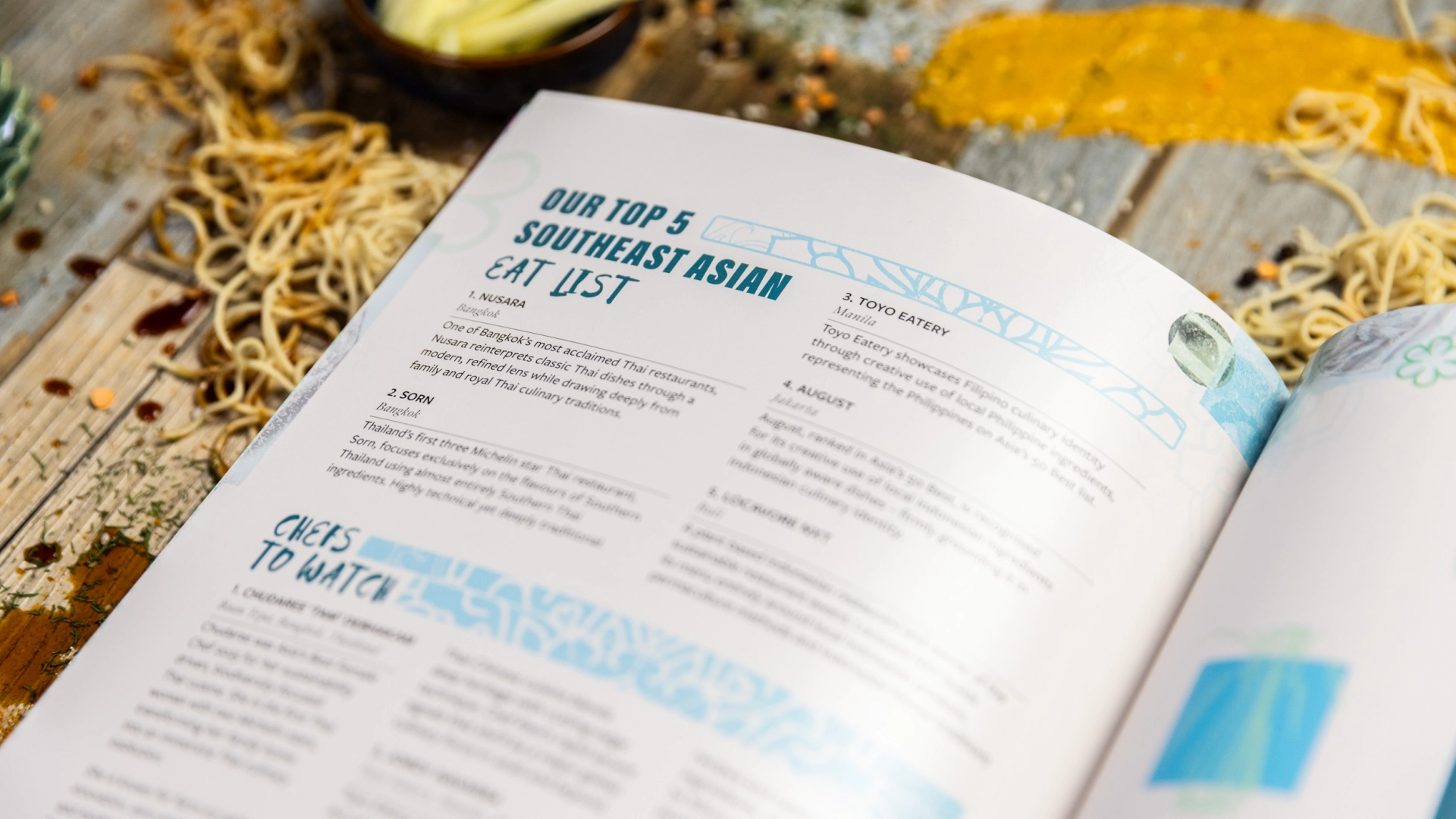
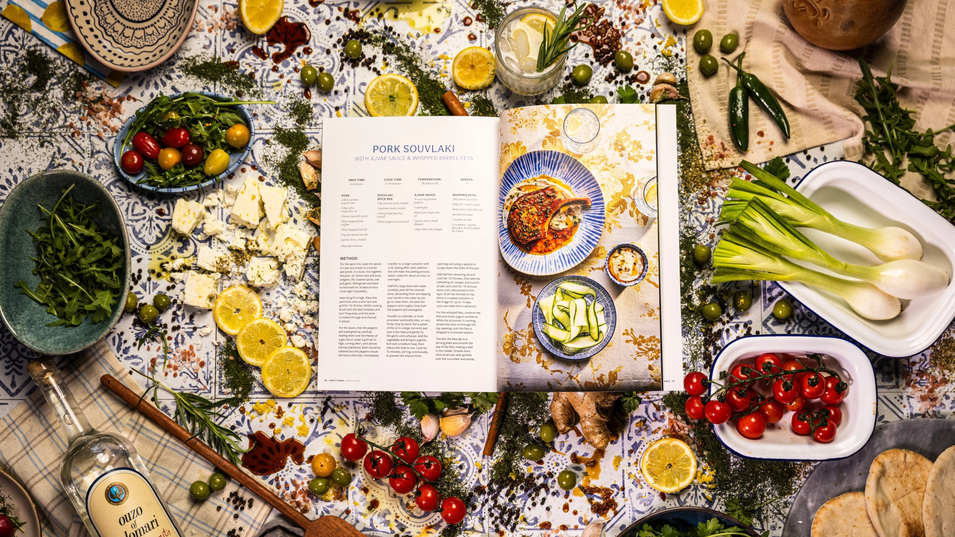
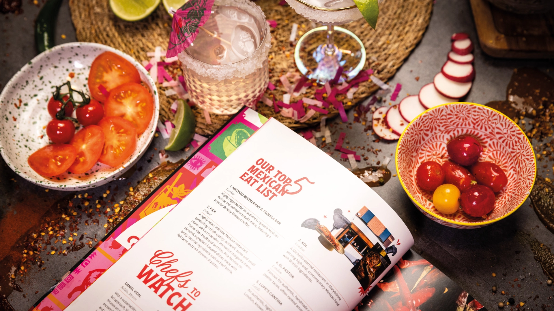
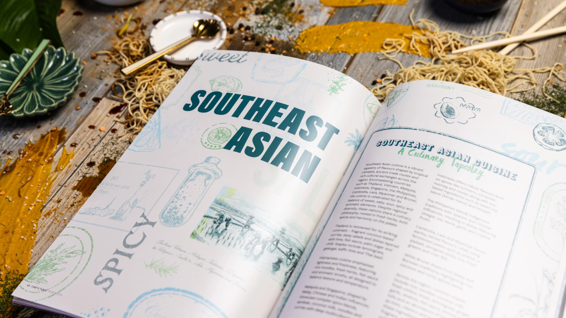
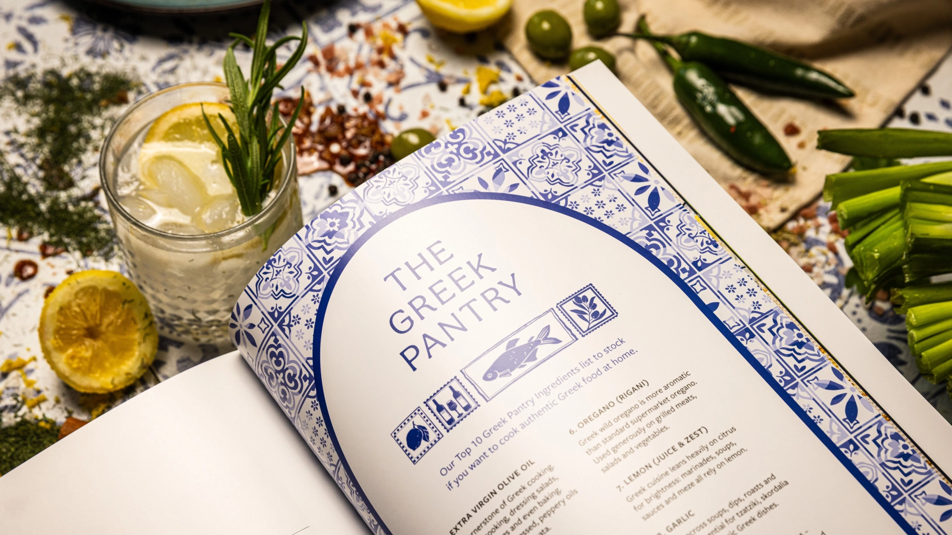
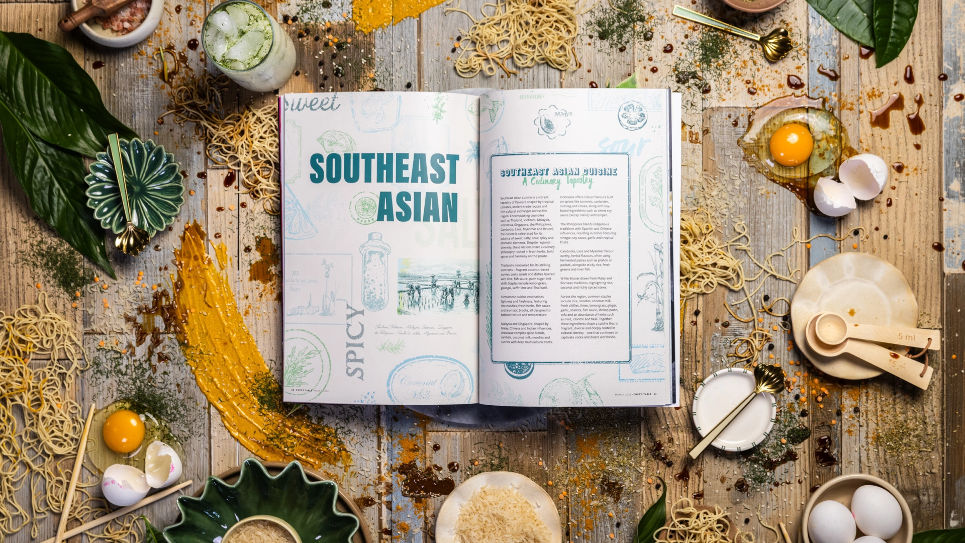
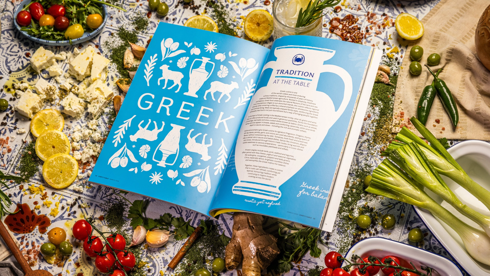
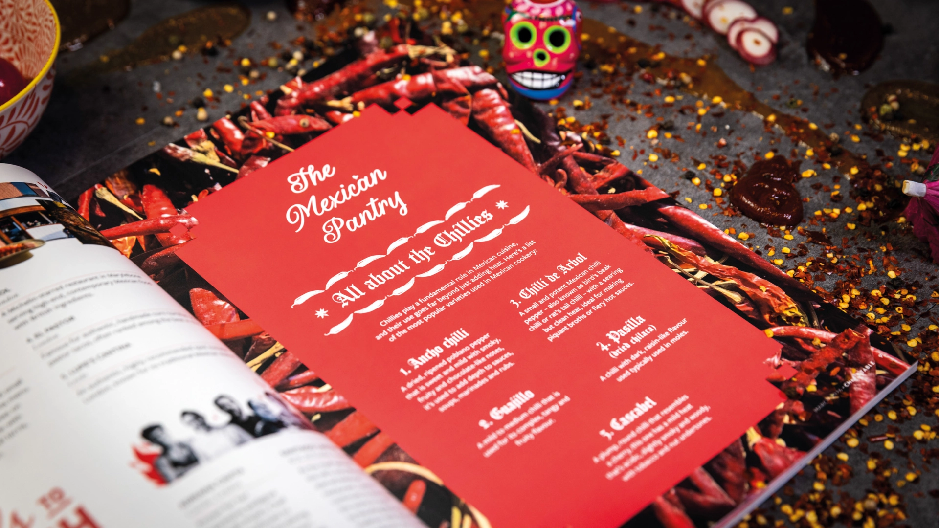
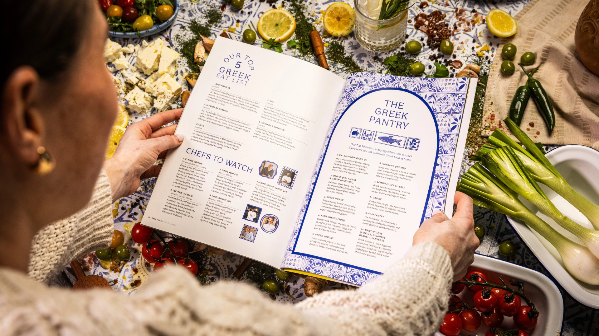
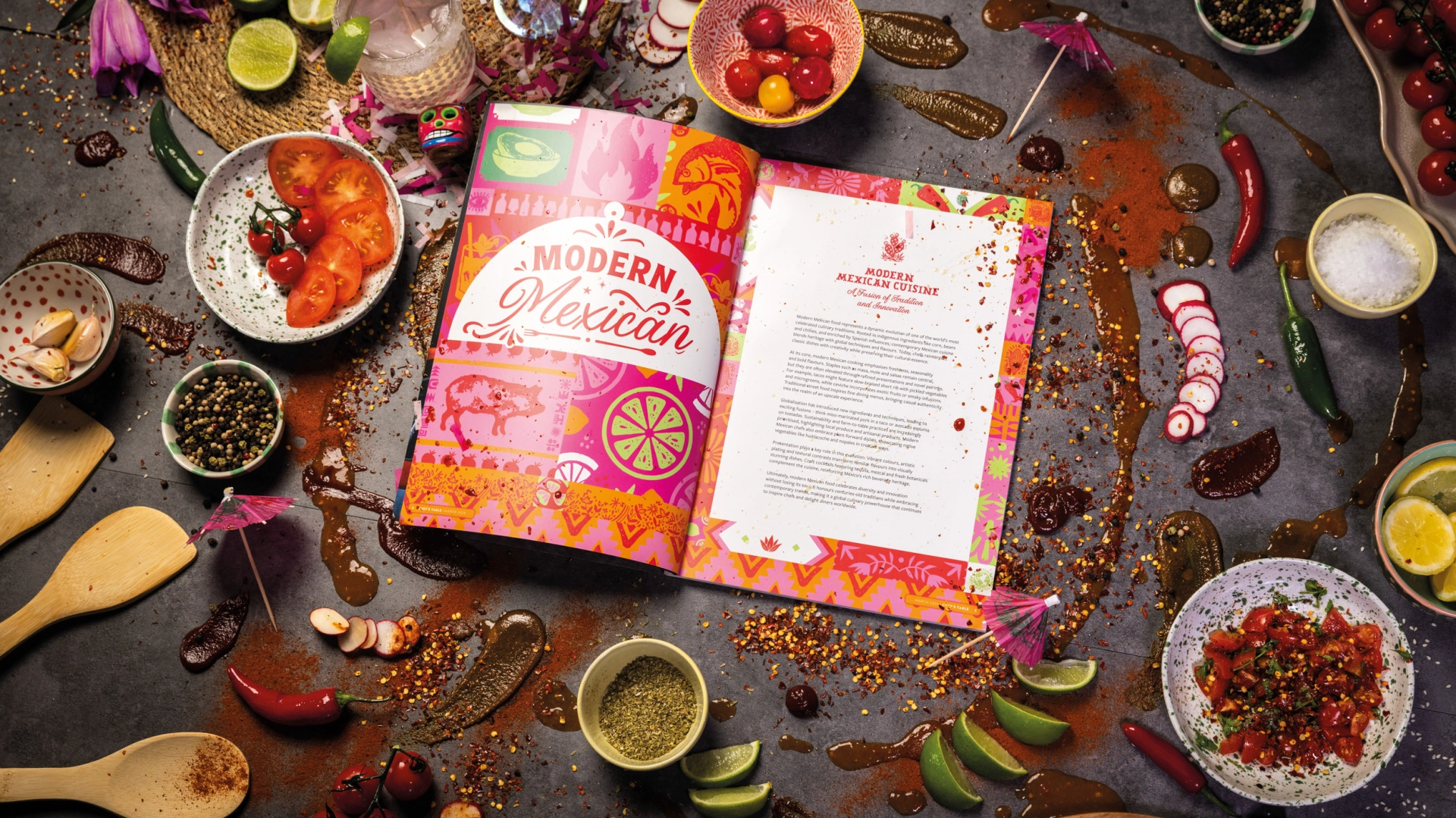
The trends and cuisines we have focused on, from modern takes on Indian and Mexican staples to the emerging popularity of the likes of Greek & Asian cuisines are all proving pivotal as trends that are driving our development and in turn the demand to deliver culinary excitement and ultimately delicious food to our customers.
Karen: How do you strike the balance between visual perfection and maintaining a natural, organic feelig to the layout?
That’s probably the biggest part of the job, to be honest. You want it to look beautiful but the second it starts to feel too perfect, you lose the appetite. Nobody wants to eat something that looks overworked. So we’re always adjusting.
A lot of it comes down to knowing when to stop. There’s a moment where the dish looks its best, and if you keep going past that, you actually lose something.
Sharon: How do you balance making food look aspirational and premium while still keeping it authentic and appetising?
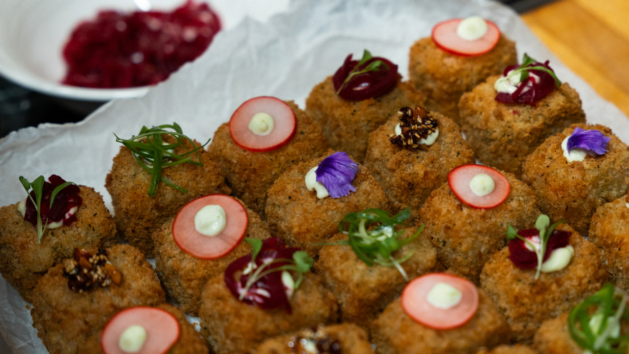
It’s definitely all about light and creating a mood, taking the viewer on a journey. That’s when they feel inspired and their mouth starts to water! That subtle highlight on a glossy thick sauce or introducing shadow to enhance texture. Looking premium comes with the right techniques used in camera, choosing the right lens, aperture, and not overdoing it in the edit. Authenticity relates back to the styling, letting crumbs fall, drips drip and allowing the food the perform like real food.
Sharon: How does this project compare to other food shoots you’ve worked on in terms of creative ambition, teamwork and process or execution?
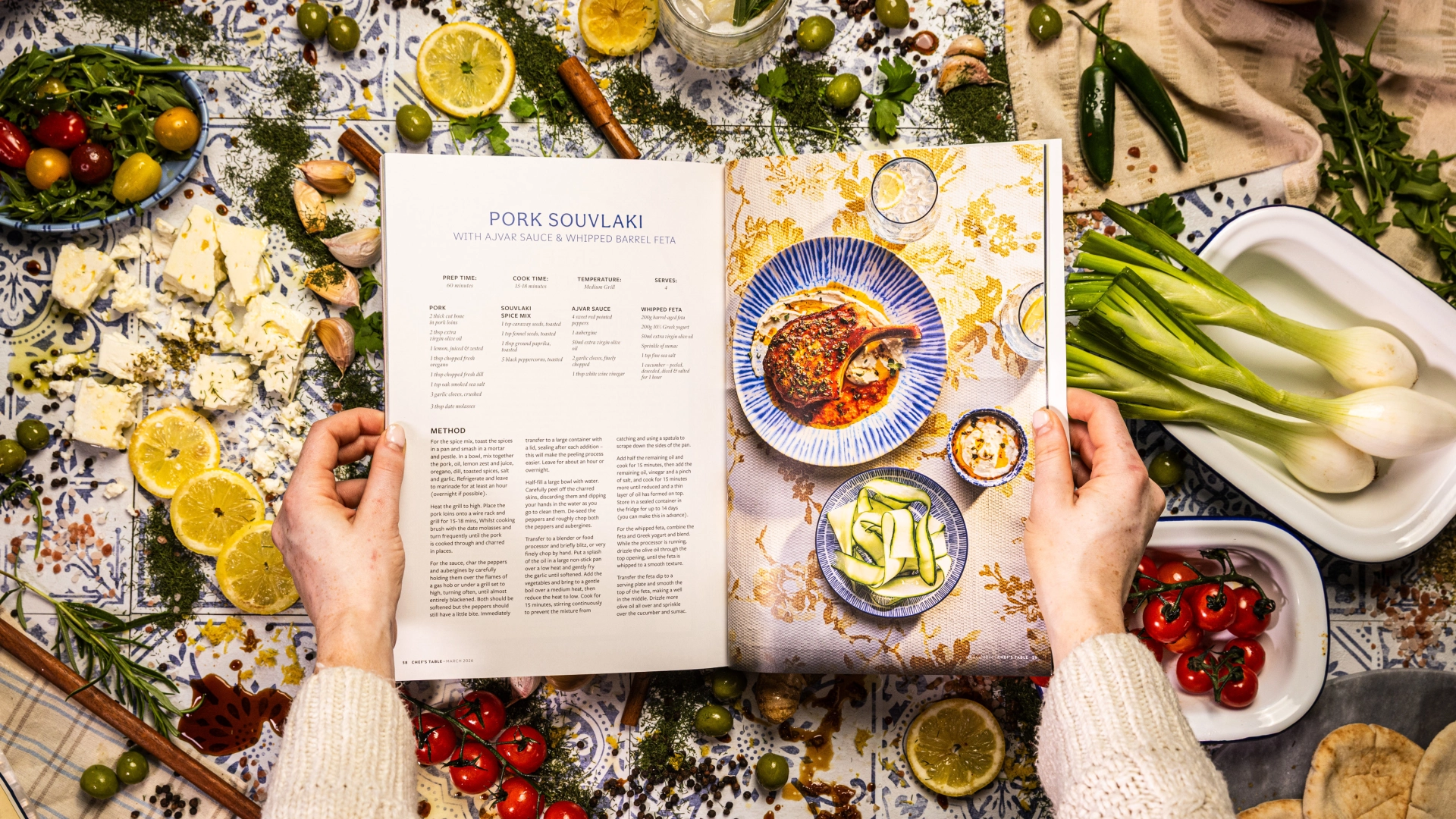
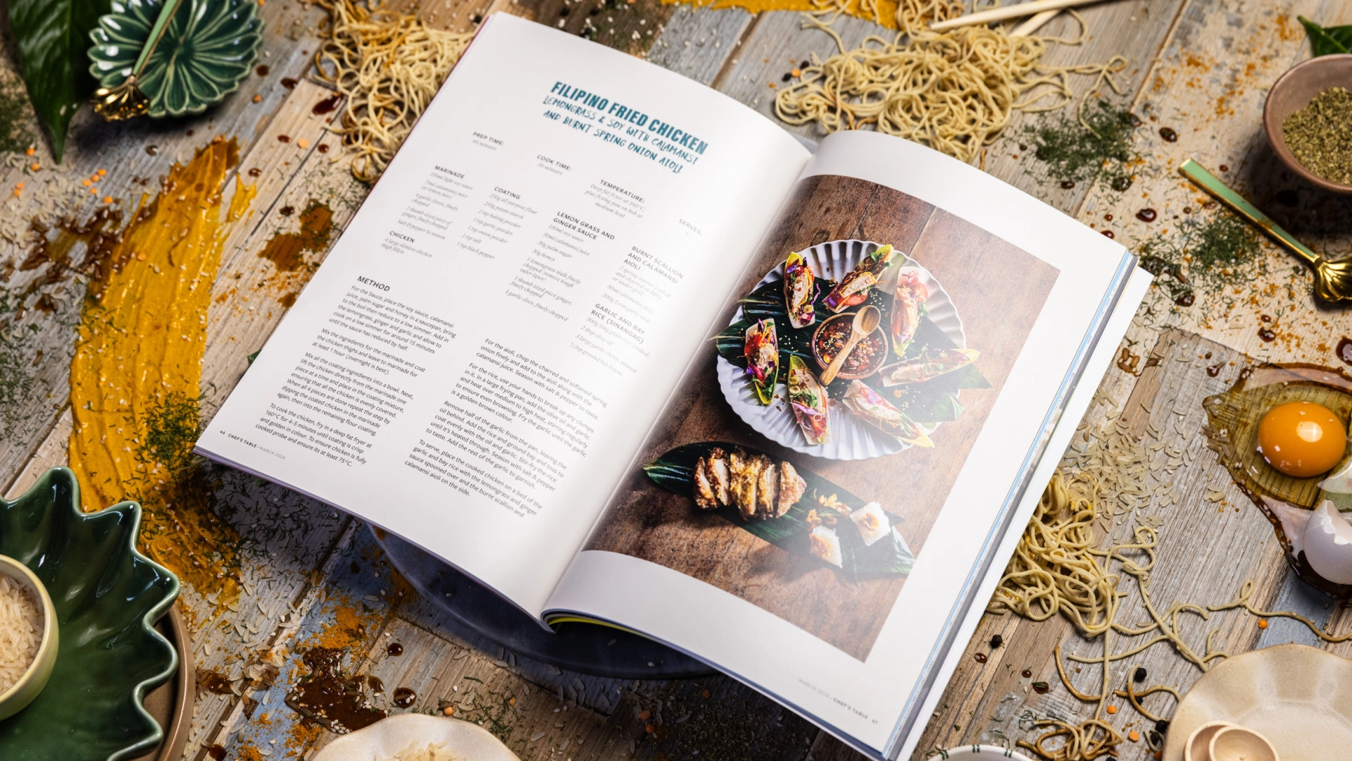
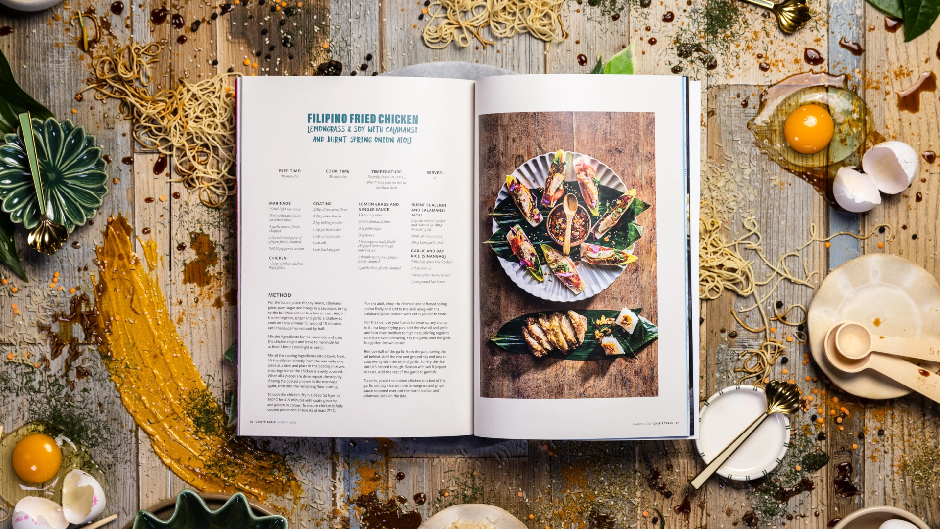
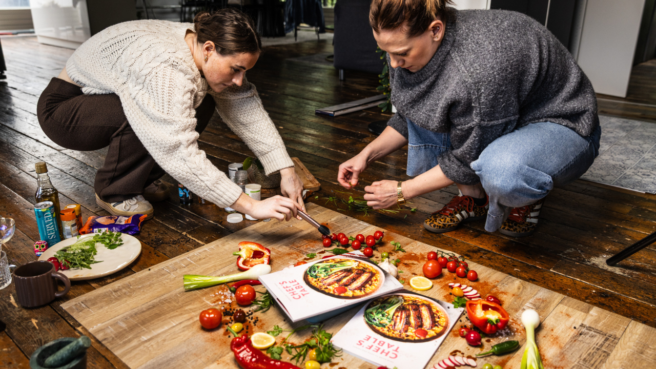
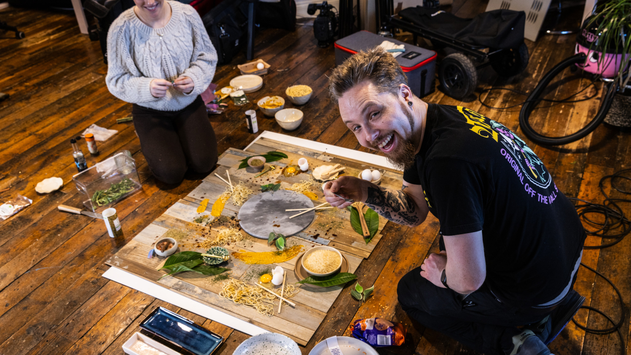
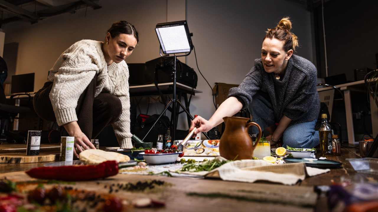
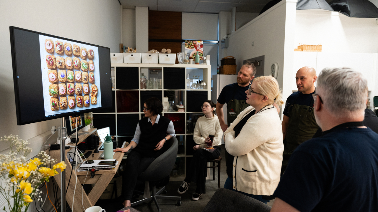
There’s a lot of planning and organisation that go into every shoot but for a project like this there’s the additional element of design and overlaying text and recipes onto the images. That all needs to be considered ahead of time and it really forces you to think about every little crumb, fork or herb placement as it may interfere with something.
This level of detail enhances creativity, pushing you to think carefully about every element in the shot. Aaron and his team bring strong ideas, offering plenty of inspiration. Whitenoise builds a clear deck with styling direction, colour themes, and layout, helping shape each shoot. Karyn then expertly arranges the food on set. Shooting tethered allows for instant review, so we can refine as we go. It’s a fully collaborative process, driven by shared energy and creativity.
Sharon: In your view, what makes a food image truly compelling in a high-end editorial context like Chef’s Table?
For an editorial like Chefs Table, every image although individual has to work together and look like they belong as a set. Variety is also important, choosing a mix of angles, styling, colour palette, texture, light and lenses all matter when it comes to making a compelling image to keep the viewer interested and wanting more - which of course is the ultimate goal with any food image. To make something look ‘high end’ comes down to the skill set of those involved - from how the dish is prepared for set, the arrangement of food on the plate and the final decision making of enough herbs, enough props or enough editing. Knowing these things comes with experience but also instinct and the team I worked with on Chef’s Table have plenty of both - that’s what makes the final results work so well.
Sharon: What challenges come with shooting for a publication like this, and how were they overcome as a team?
I have worked with this team for so long now that it feels like we are all in complete harmony! We all know our roles instinctively and the part we have to play in the shoot. So from my perspective the only real challenge comes from keeping everything on time, there’s a lot to get through on the shoot days and timing is everything to make sure we hit the mark. Planning is key, we have pre production meetings on the recipes, the props we will use and styling, right down to the angle we are going to shoot at for each individual dish.